Collection & Pagination
The Collection Node renders a list of items from array data — for example, a list of posts fetched by a PostsDataFetchingNode. It is the primary tool for building repeating layouts like post grids, user lists, and search results.
See Working with Dynamic Data for details on setting up array data sources.
How Collection Works
A Collection Node automatically creates CollectionElementNode children — one per displayed item. All CollectionElementNode instances share the same structure: when you add or modify a node inside one element (for example, adding a Template Text Node), the change is mirrored to all other elements.
CollectionNode
├── CollectionElementNode
│   └── WrapperNode
│       └── TextNode
└── CollectionElementNode
    └── WrapperNode
        └── TextNode
When the collection renders, it iterates over the array data and passes each item to its corresponding CollectionElementNode under the configured Item Name. Child nodes inside the element can then reference the current item via ${} syntax (e.g. ${item.post_title}).
Settings Tab
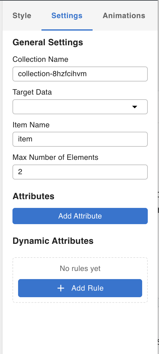
Collection Name
An identifier for this collection instance. Other nodes that extend the collection's functionality — PaginationNode and SearchBoxNode — use this name to associate themselves with the correct collection. You can leave it as the default or rename it for clarity when a template has multiple collections.
Target Data
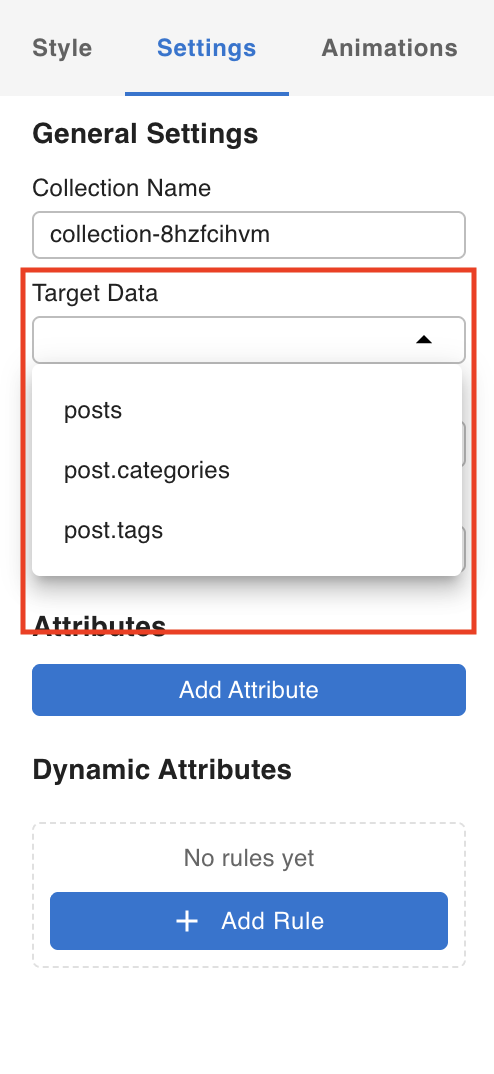
A dropdown listing any array-type Data Fetching Nodes present in the template. Select the data source you want this collection to iterate over.
Item Name
The variable name each array item is bound to during iteration. Child nodes inside the collection access the current item using this name in ${} expressions. For example, with the default name item, you would write ${item.post_title} to display the post title.
- Array data is fetched by the data source
- Collection iterates over each item in the array
- Each item is bound to the Item Name variable (e.g.
item) - Child nodes inside the element read the current item:
${item.post_title}
Max Number of Elements
The maximum number of CollectionElementNode children to display at one time. If the array has more items than this limit, use a PaginationNode to page through the rest. If the array has fewer items than the limit, only the available items are shown.
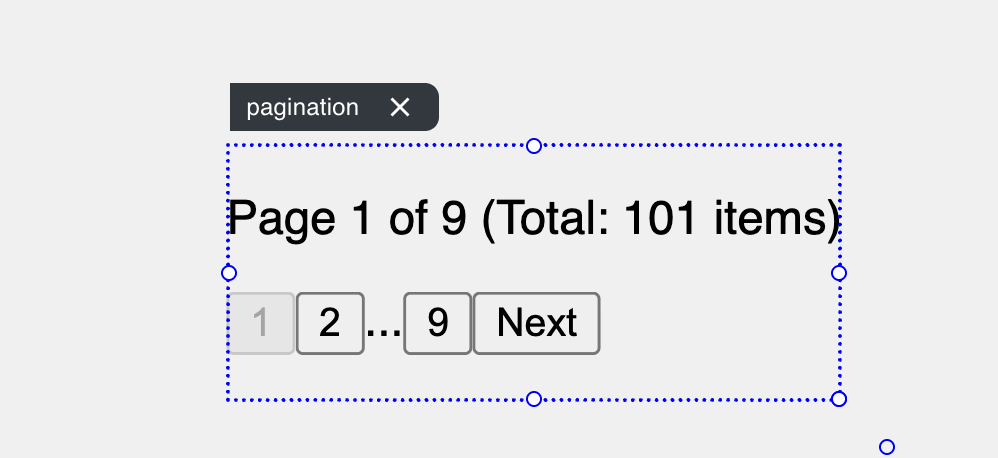
PaginationNode
The Pagination Node associates with a Collection Node and renders page navigation controls for it.
Settings Tab
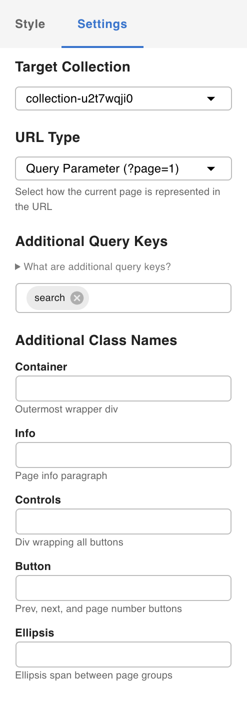
Target Collection
Select the Collection Node this pagination should control. The dropdown is populated with Collection Nodes already present in the template. Once associated, the Pagination Node pulls total-count and current-page metadata from the collection's data source and renders the appropriate page buttons.
URL Type
When a user clicks a page button, you can optionally update the URL (push state) using either a segment (path parameter) or a query parameter. This lets the correct page and results be restored when the URL is shared or the browser is refreshed.
This requires Path and Query Parameter Mapping to be configured in the template. See Working with Dynamic Data for details on URL mapping.
Additional Query Keys
Extra URL parameter keys that the Pagination Node should carry along when changing pages. This is useful when a SearchBoxNode is associated with the same collection: if the user is on page 2 with a search term of "movie" in the URL, adding search here ensures the page button sends {page: 2, search: "movie"} to the data query — preventing the search term from being lost on navigation.
Additional Class Names
By default, the elements wrapped inside the Pagination Node have no applied styles. Use this field to assign CSS class names to the pagination wrapper so you can style it via the Styles system.
For an example of how to style pagination using Tailwind utility classes, see Using Tailwind.
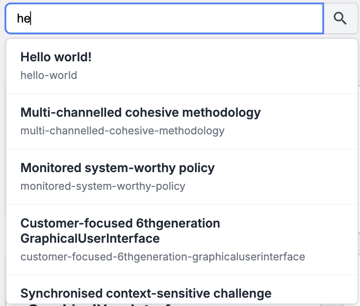
SearchBoxNode
The Search Box Node provides a text input that filters the associated Collection Node's data in real time.
Settings Tab
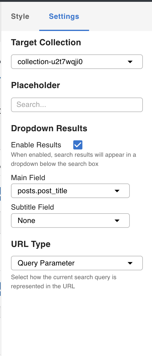
Select the Target Collection from the dropdown to associate the search box with a collection.
Dropdown Results
When enabled, the search box displays a quick-results dropdown as the user types — before they submit. You can configure which fields from the data source appear as the main title and subtitle in each dropdown result row.