Canvas
The canvas is the main editing environment in WP Next Editor. It is divided into four areas: the main editing area, the left navigation panel, the right navigation panel, and toolbars in the header and footer.
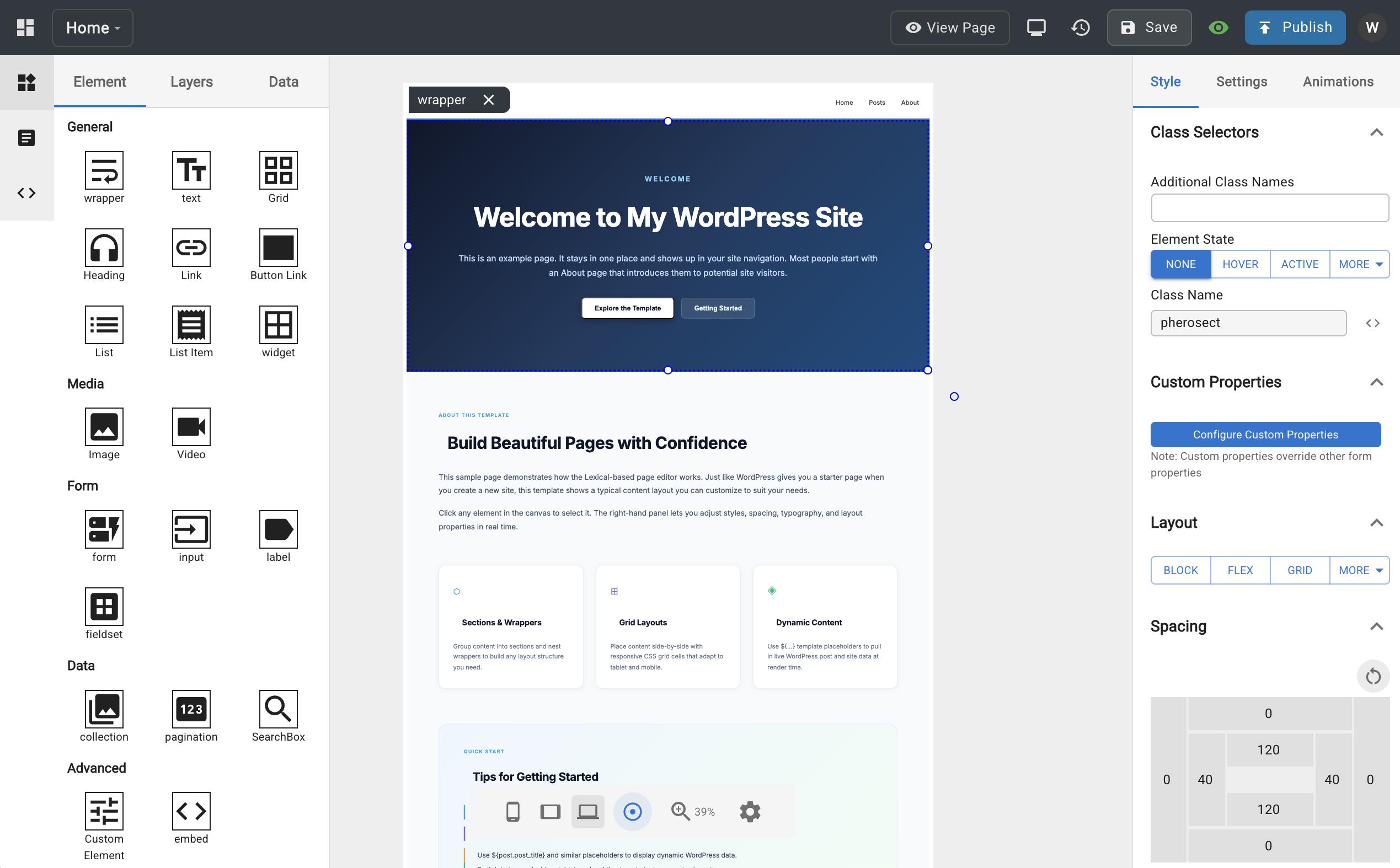
Main Area
The central canvas is where you build and preview your template.
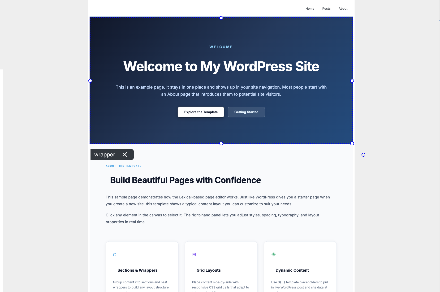
- Select nodes — mouse over and click any element to select it
- Drag and drop — drag a selected node to reposition it, or drop it inside another element to nest it
- Add elements — drag new elements from the Elements tab in the left nav onto the canvas
- Resize and rotate — after selecting a node, hover over the corner/edge handles to adjust width, height, or rotation (CSS
transform) - Zoom — scroll the mouse wheel to zoom in and out
- Right-click context menu — cut, copy, paste, or delete the selected node
Left Nav
The left navigation panel has three tabs: Element, Templates, and Custom Codes.
Element Tab
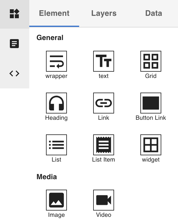
- Elements — drag elements from this list onto the main canvas to add new nodes to your template
- Layers — a tree view of the Lexical node tree showing the current template's structure
- Drag nodes within the Layers panel to reorder them
- Click the hide icon next to a node to temporarily hide it on the canvas without deleting it
- Data — create data fetching definitions (e.g. post, posts, user, users) to bind WordPress data to your template
Templates Tab
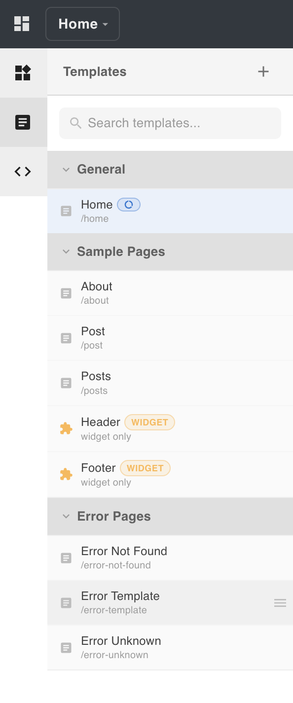
Templates are grouped into collections. Each template item shows a menu icon with options to switch to, duplicate, or delete the template.
- Collections — group related templates together (e.g. a collection for error pages). Collections can be renamed or deleted.
- Reordering — drag templates to change their order within a collection. Use the up/down arrow buttons to reorder collections.
- The General collection is the default and is always pinned at the top of the list.
See the Templates Tab section above for details on managing collections.
Custom Codes Tab
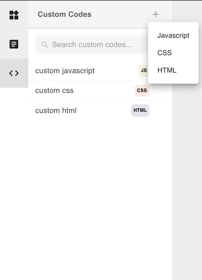
Create reusable JavaScript, HTML, or CSS code blocks. Once created, custom codes can be attached to individual templates via the footer toolbar.
See Custom Code for how to create and attach custom codes to a template.
Right Nav
The right nav appears when you select a node on the canvas. It has up to three tabs depending on the node type.
Styles Tab
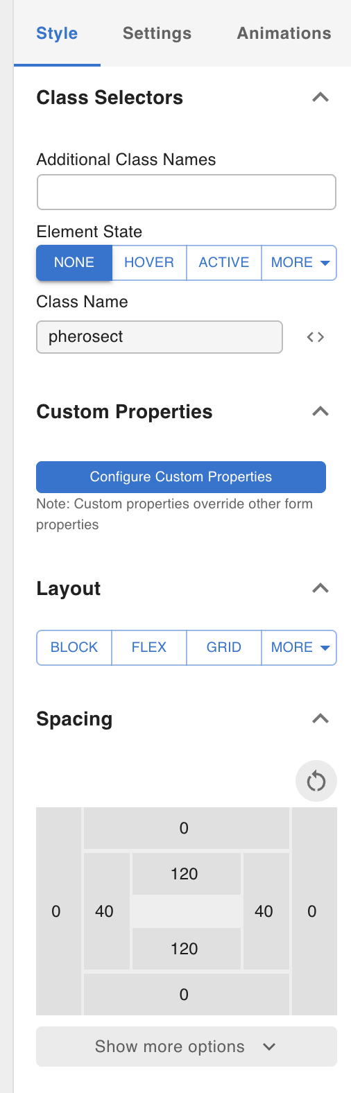
All nodes have a Styles tab where you can adjust CSS properties. Styles are device-aware: switching to a different breakpoint (mobile, tablet) in the footer toolbar lets you set per-device values, which produce the corresponding @media queries at render time.
See Styles for details on how styling works across devices and CSS states (e.g. hover).
Settings Tab
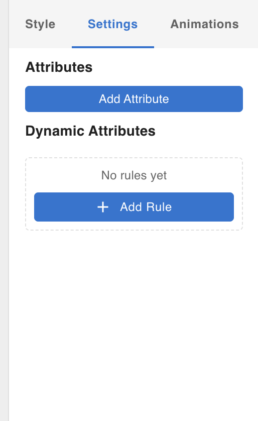
Most nodes have a Settings tab for node-specific configuration, including:
- Attributes — add arbitrary HTML attributes to the rendered element
- Dynamic Attributes — bind attribute values to data from the WordPress database
Animation Tab
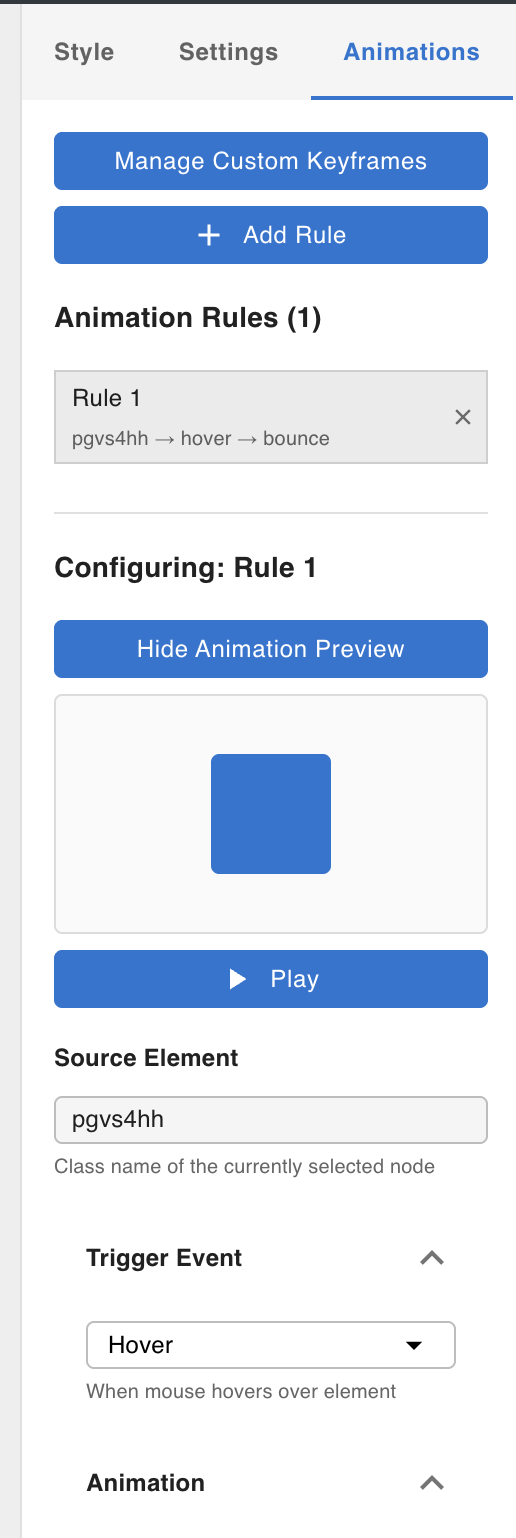
Most nodes have an Animation tab where you can attach CSS animation keyframe animations to the node.
See Animations for how to manage keyframes and attach animations to nodes.
Footer Toolbar
The footer toolbar controls the canvas view and provides access to template-level settings.
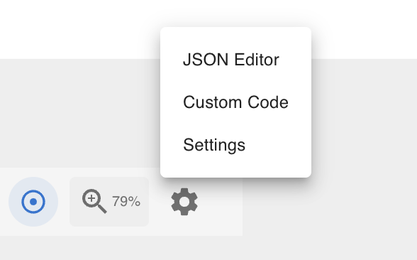
Settings Menu
Clicking the settings icon opens the template settings panel.
JSON View
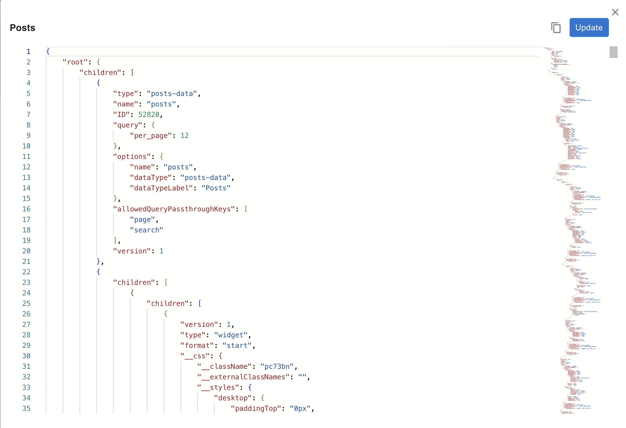
A code editor that lets you directly read and edit the raw Lexical JSON for the current template. See JSON Editor for details.
Custom Code
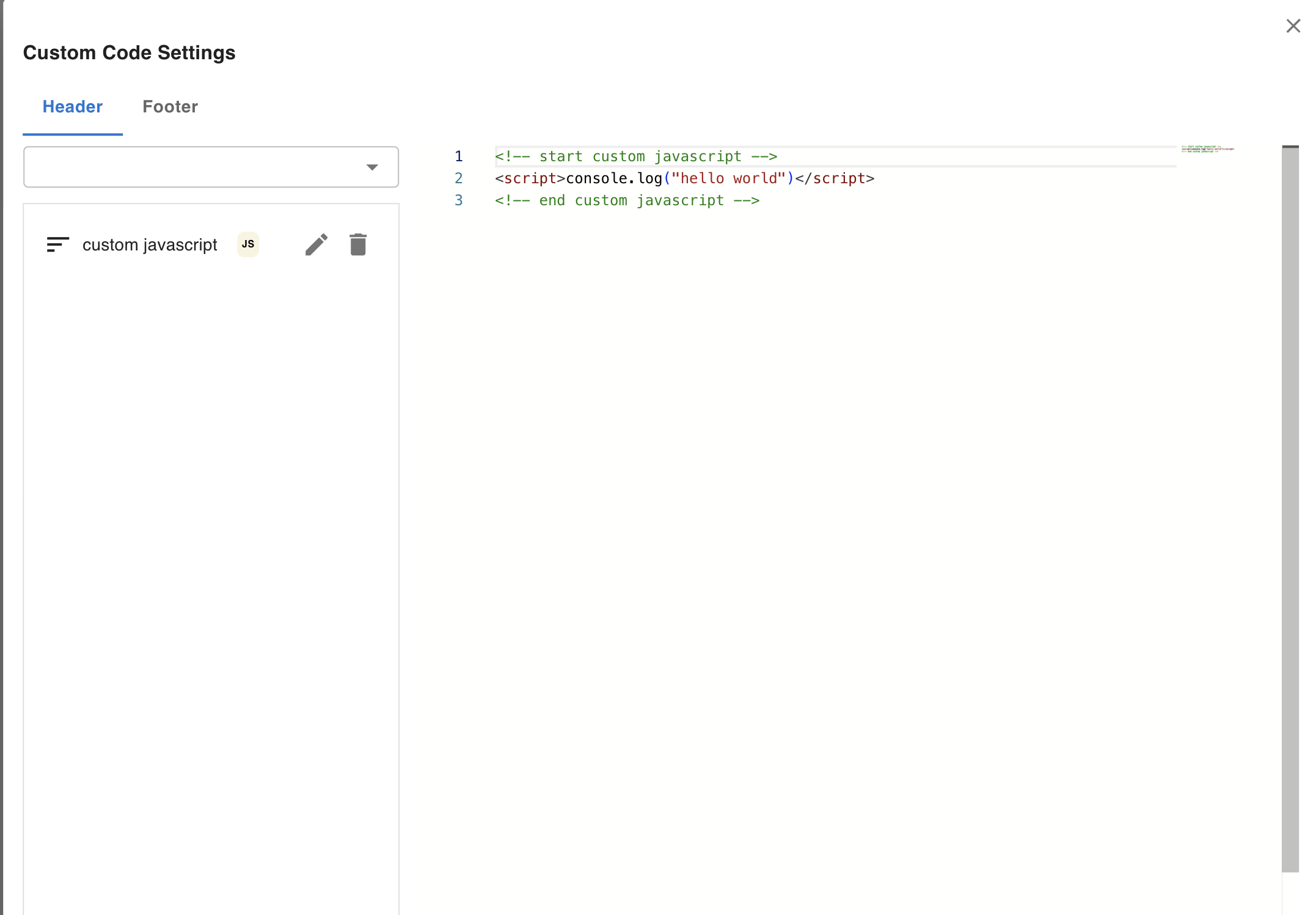
Add or remove custom code blocks (JavaScript, HTML, CSS) to the template's <head> or <body>. Custom code blocks are created in the Custom Codes tab of the left nav. See Custom Code for how to create and manage them.
Template Settings
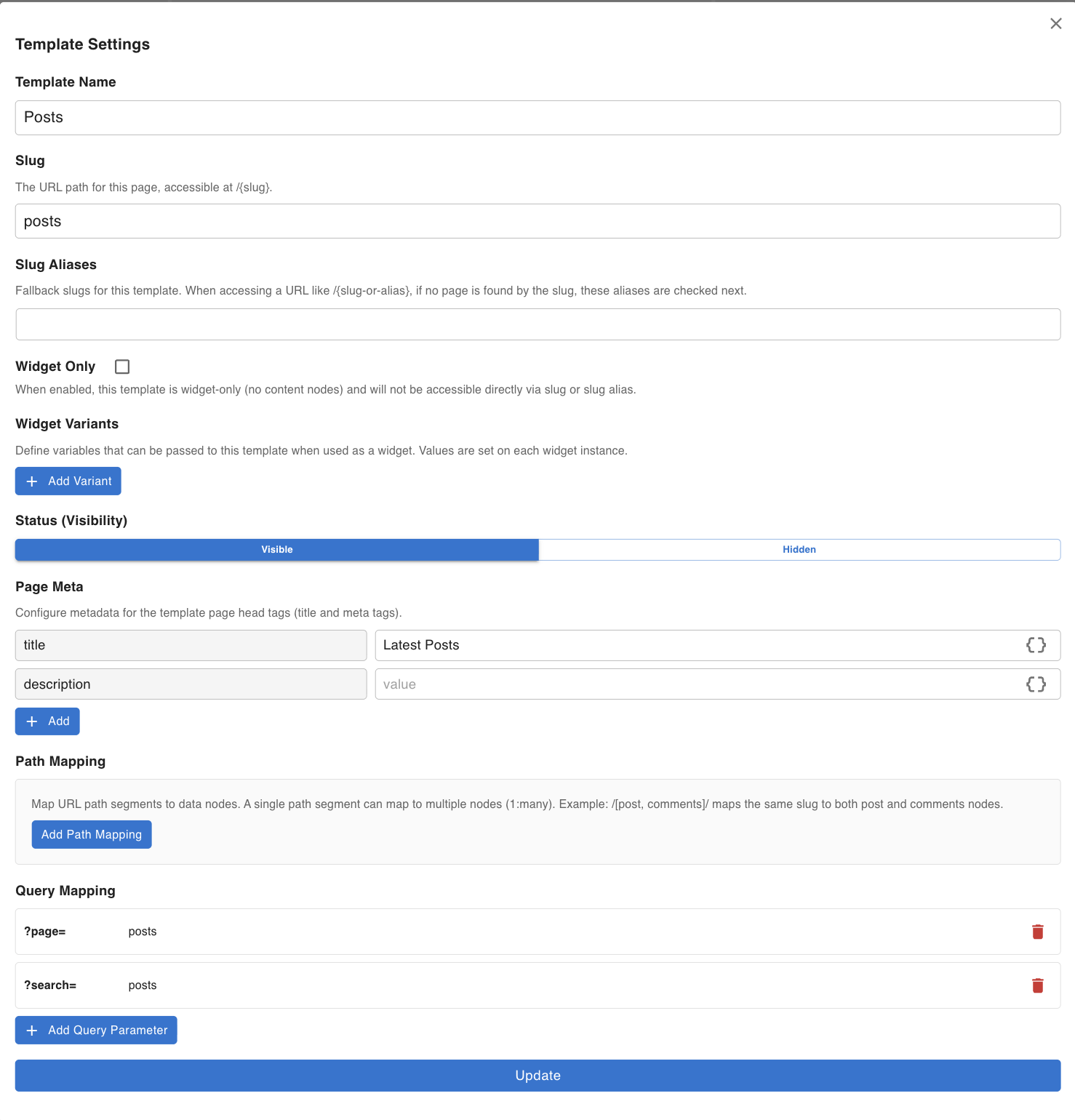
Configure the current template:
- Template name — the display name shown in the left nav (does not affect the URL)
- Slug and Slug Alias — the URL path segment used to serve this template (e.g.
http://[domain]/[slug]). The slug is set when the template is created and can be changed here. - Widget Only / Widget Variants
- Widget Only — when enabled, the template is exclusively used as a widget component and is not accessible via a URL slug. Use this for reusable headers, footers, and other sub-templates.
- Widget Variants — define named variants on a widget template. Each variant has a name, type (
booleanorstring), and a default value. When a Widget Node in another template embeds this widget template, the node's Settings panel shows an input field for each declared variant. This lets a single widget template render different content per embedding — for example, one Widget Node can passtitle = "Blog"while another passestitle = "News". See Widget Node for full details on the widget system.
- Page Meta — add
<meta>tags that are injected into the final rendered HTML for this template - Path Mapping and Query Mapping — define how URL path segments and query parameters are mapped to data fetching inputs. See Working with Dynamic Data for how to configure data fetching nodes and expose dynamic values in template content.
See Template Settings for a full reference of every field in this modal.
Zoom
Use the zoom controls to scale the canvas view in and out.
Pan Mode
Toggles between two scroll modes:
- Pan mode on — the canvas behaves like Figma: move the canvas by dragging
- Trackpad — drag with two fingers
- Mouse — hold Space, then click and drag to move the canvas
- Pan mode off — the canvas is scrollable (CSS
overflowstyle)
Breakpoints / Devices
Switch the canvas between device sizes (desktop, tablet, mobile). When you switch to a non-desktop breakpoint, the Styles tab in the right nav switches context to that device — any CSS values you set will be applied only at that breakpoint via @media queries.
See Styles for details on how styling works across devices and CSS states (e.g. hover).
Header Toolbar
Preview
Opens a live preview of the current template in a new tab or panel without publishing.
Save
Saves the current template state. An optional comment can be added to identify the save point. Up to 30 save history entries are retained per template.
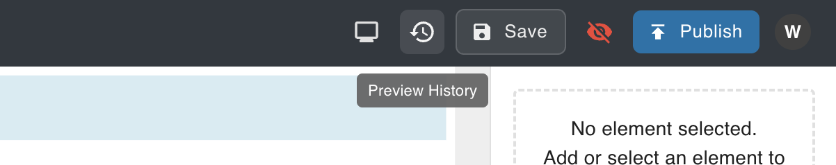
Preview History
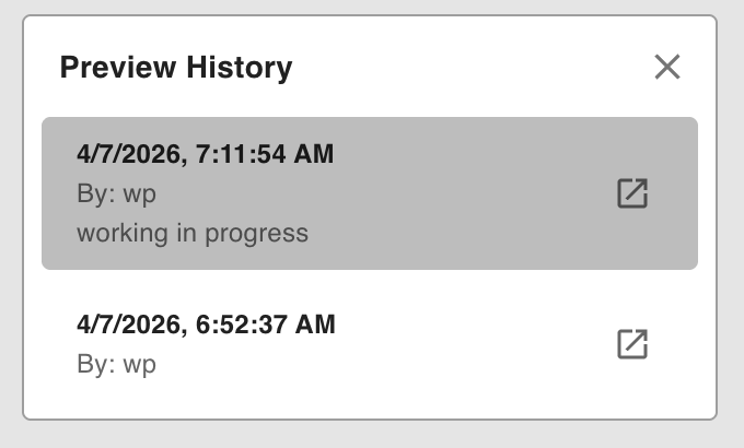
Opens a list of previous saves for the current template. You can switch to any saved version to preview or restore it.
Visible
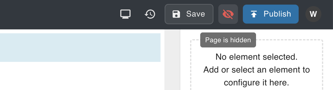
Toggles the template's visibility status. This sets wp_posts.post_status to publish or draft.
Publish
Saves the current template content to production. This writes the Lexical JSON to wp_posts.post_content.
A template is publicly accessible via its URL only when both conditions are true:
- Published —
wp_posts.post_contenthas been saved via the Publish button - Visible —
wp_posts.post_statusis set topublishvia the Visible toggle
Both must be set for the page to be accessible.