Styles (CSS)
The Styles tab in the right panel is the primary way to apply CSS to any node or element. Each property you set is stored per-device (breakpoint) and per-state (e.g. hover), and the editor generates the corresponding CSS media queries and pseudo-class selectors automatically.
A working knowledge of CSS is helpful. If you are new to CSS, MDN's CSS Getting Started guide is a good starting point.
Class Name
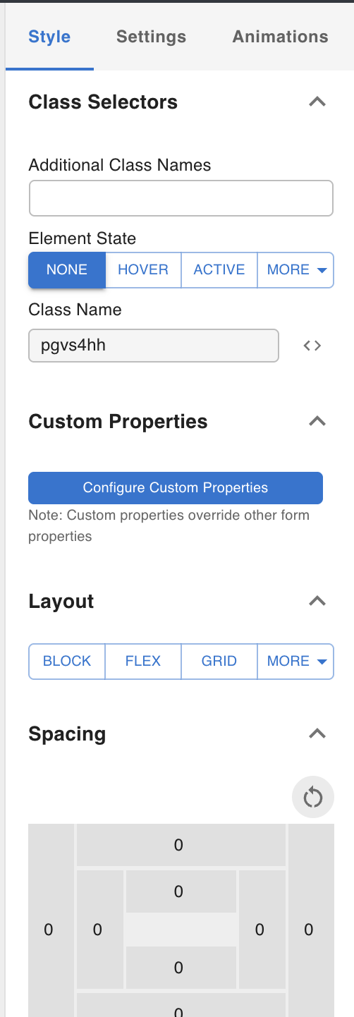
When a node or element is created, a unique class name is automatically assigned (e.g. pc73bn). This class name is internal and cannot be changed — it is used to target the element for style injection and DOM manipulation.
CSS Viewer
Click the code icon next to the class name input to open the CSS Viewer. This modal shows the raw CSS properties assigned to the selected node, which is useful for debugging.
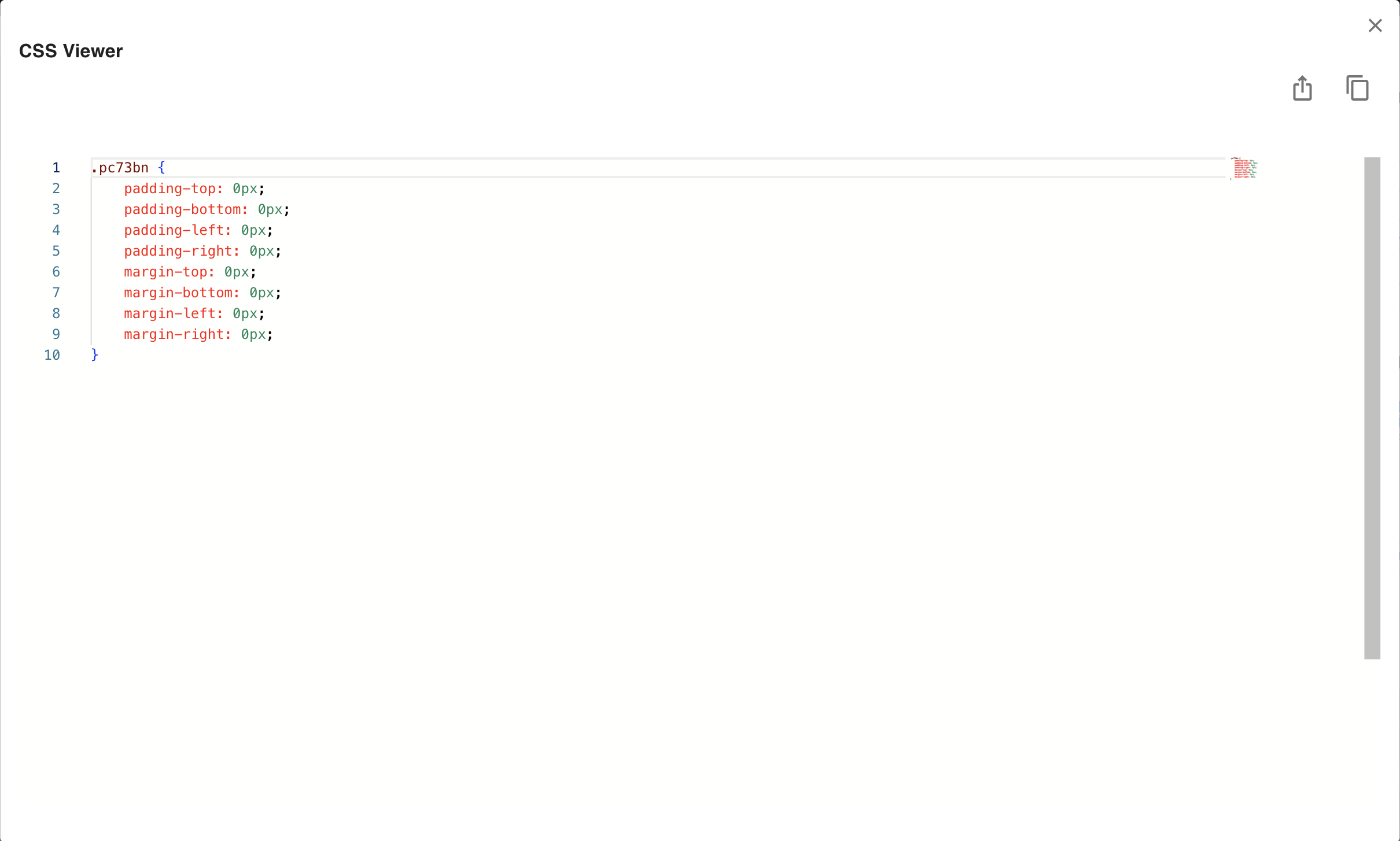
The view depends on the current element state:
- When state is "none" — shows the complete CSS for all devices and states, including media queries.
- When state is not "none" (e.g. hover) — shows only the CSS for the current device and state combination.
Example for a node with width set differently across devices and states:
/* state: none */
.pc73bn {
    width: 300px;
}

.pc73bn:hover {
    width: 200px;
}

@media screen and (max-width: 768px) {
    .pc73bn {
        width: 50px;
    }
}

@media screen and (max-width: 768px) {
    .pc73bn:hover {
        width: 400px;
    }
}
/* state: hover, device: mobile */
@media screen and (max-width: 768px) {
    .pc73bn {
        width: 400px;
    }
}
Breakpoints and States
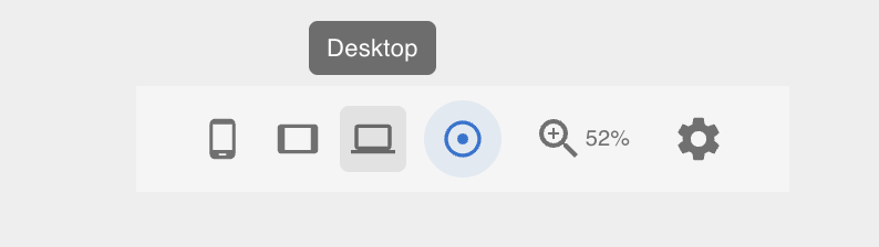
Breakpoints
Three breakpoints are supported: Desktop, Tablet, and Mobile. Switch between them using the Footer Toolbar at the bottom of the canvas.
CSS values set at a lower-priority breakpoint override the higher-priority ones via media queries. The precedence order is:
Desktop → Tablet → Mobile
Mobile overrides Desktop; Tablet overrides Desktop but is overridden by Mobile. This is the same cascade model used by Webflow and Framer. Under the hood the editor generates @media screen and (max-width: ...) blocks:
.pc73bn {
    width: 100px;  /* Desktop */
}

@media screen and (max-width: 768px) {
    .pc73bn {
        width: 200px;  /* Tablet */
    }
}
States
States let you apply different CSS values when a user interacts with an element. Switch to a state using the Element State section in the right panel.
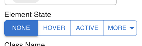
None means no state — the default appearance. CSS values set under a state are generated as pseudo-class selectors (e.g. :hover):
.pgvs4hh {
    width: 300px;
}

.pgvs4hh:hover {
    width: 200px;
}
Combining breakpoints and states
Breakpoints and states are independent dimensions. You can set any combination — for example, different widths on Desktop vs Mobile, each with their own hover value:
| Device | State | Width |
|---|---|---|
| Desktop | None | 400px |
| Desktop | Hover | 300px |
| Mobile | None | 200px |
| Mobile | Hover | 100px |
Generated CSS:
.pgvs4hh {
    width: 400px;
}

.pgvs4hh:hover {
    width: 300px;
}

@media screen and (max-width: 768px) {
    .pgvs4hh {
        width: 200px;
    }
}

@media screen and (max-width: 768px) {
    .pgvs4hh:hover {
        width: 100px;
    }
}
Additional Class Names
You can add extra class names to any element — useful when applying utility classes from an external framework (like Tailwind) or targeting the element with your own CSS defined elsewhere.

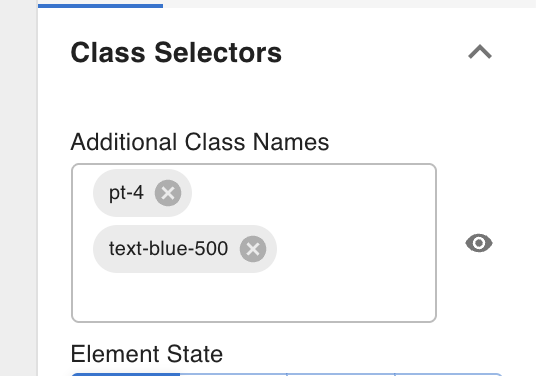
See Custom Code for how to inject external frameworks like Tailwind into a template.
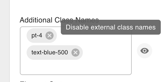
Disabling additional class names (debugging)
Click the eye icon next to an additional class name to temporarily disable it in the editor. The class is removed from the element's rendered output in the canvas without deleting it from the template — useful when a class is hiding or repositioning an element and you need to adjust its underlying styles.
Custom Properties
For CSS values that cannot be entered through the standard controls — such as calc() expressions, clamp(), or other CSS functions — use Custom Properties to enter raw property/value pairs.
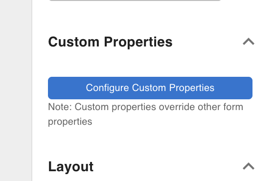
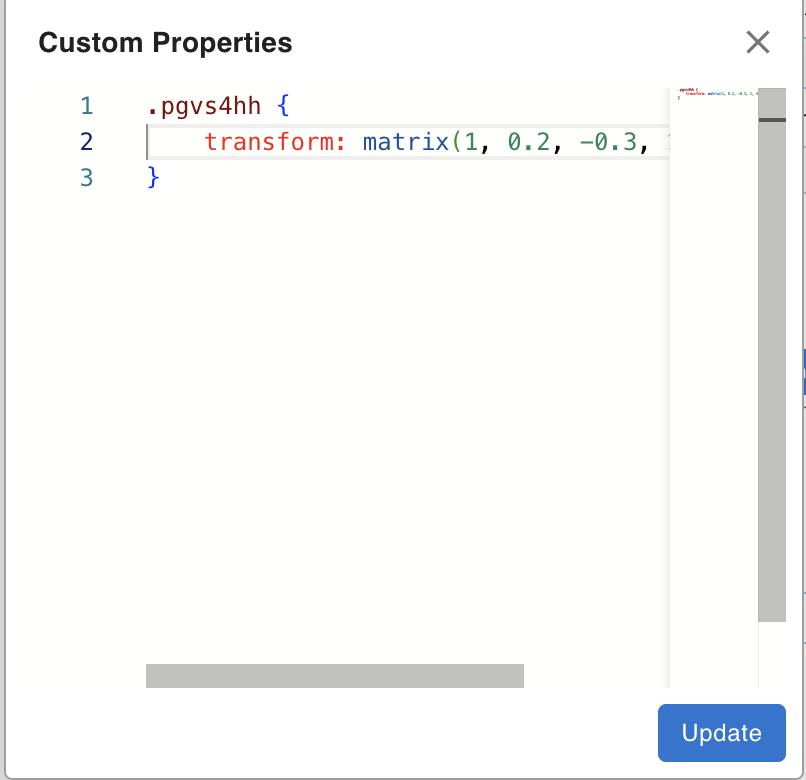
Custom Properties have lower precedence than the standard control panel values. If the same property is set both through the controls and through Custom Properties, the Custom Properties value wins — because Custom Properties writes directly into the CSS block at the same specificity level but appears after the generated styles.
Example: if Width is set to 200px in the controls and to 300px in Custom Properties, the final rendered width is 300px.
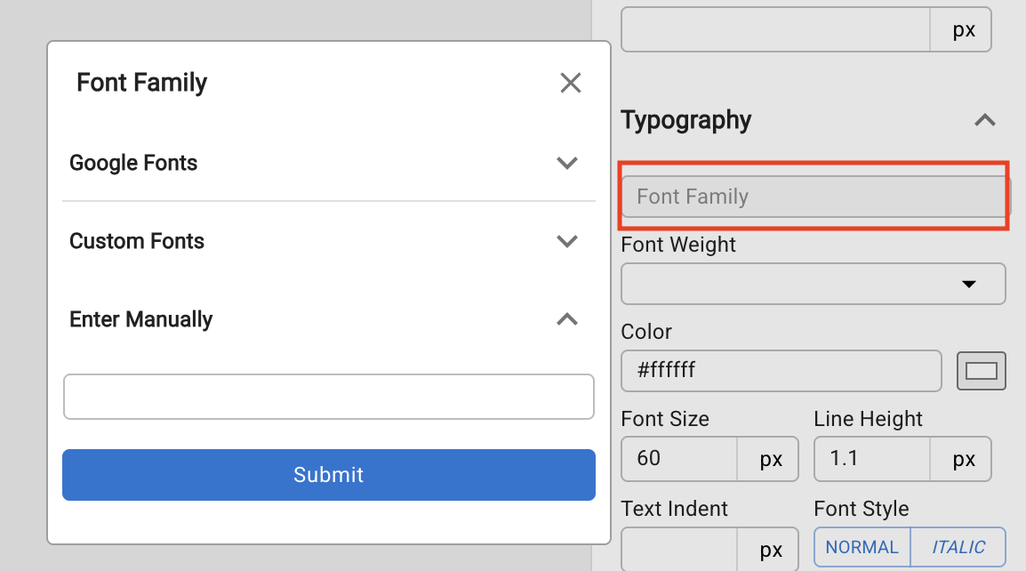
Fonts
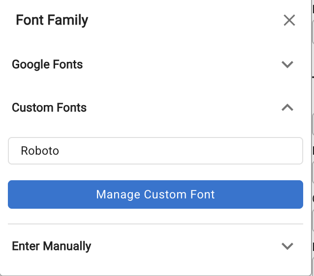
The Fonts section in the Styles tab controls the font-family applied to the selected element. Three sources are supported.
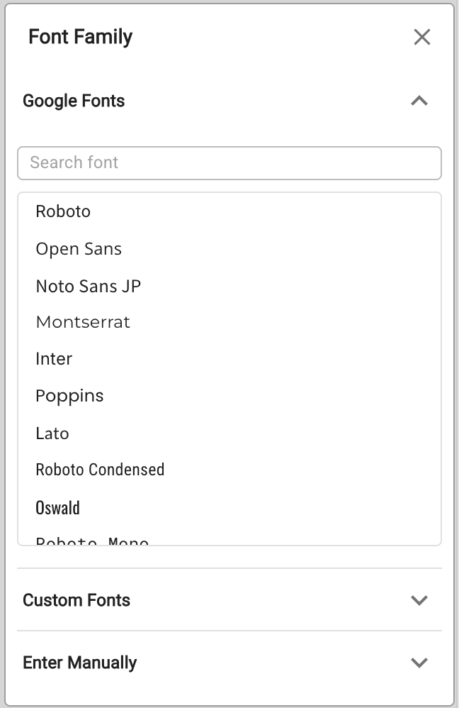
Google Fonts
Select from a curated list of Google Fonts presets. Choosing one automatically loads the font from Google's CDN — no Custom Code entry needed.
Custom Fonts
Upload your own font files and define @font-face rules. This keeps fonts self-hosted and does not depend on any external CDN.
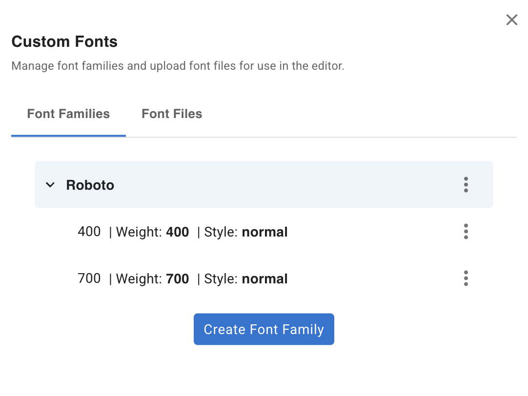
Custom fonts are built from three components:
- Font Family — creates the
font-familyname in CSS (e.g.Roboto) and acts as a container for font files - Font Files — the uploaded font files (e.g.
.ttf,.woff2) - Font Face — associates a font file with a font family and a weight/style, generating a
@font-faceblock:
@font-face {
    font-family: 'Roboto';
    font-style: normal;
    font-weight: 400;
    src: url('http://localhost:3000/uploads/Roboto-VariableFont_wdth,wght.ttf');
}
@font-face {
    font-family: 'Roboto';
    font-style: normal;
    font-weight: 700;
    src: url('http://localhost:3000/uploads/Roboto-VariableFont_wdth,wght-700.ttf');
}
Steps to add a custom font
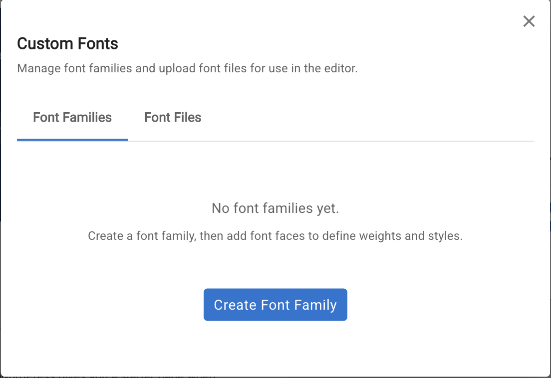
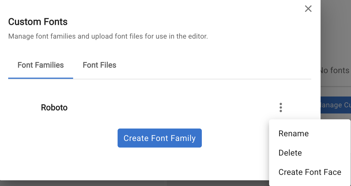
Click Manage Custom Font to open the manager.
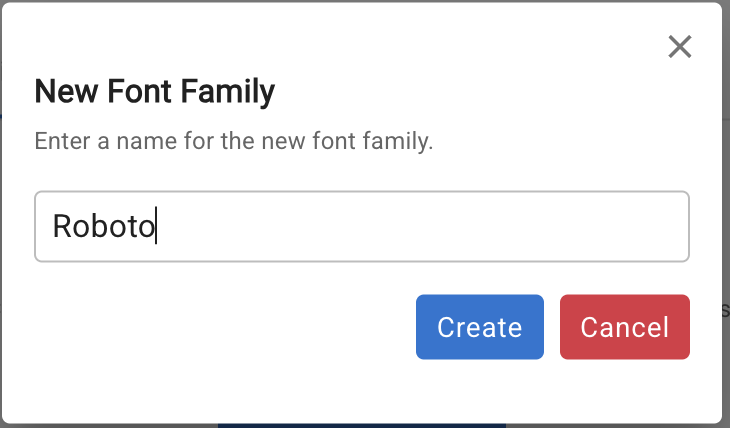
1. Create a Font Family
Click Create Font Family and enter the font name (this becomes the font-family CSS value).
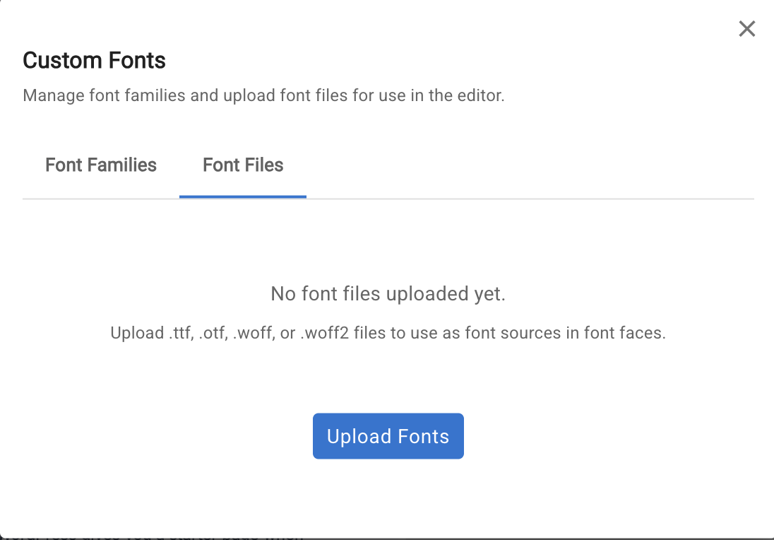
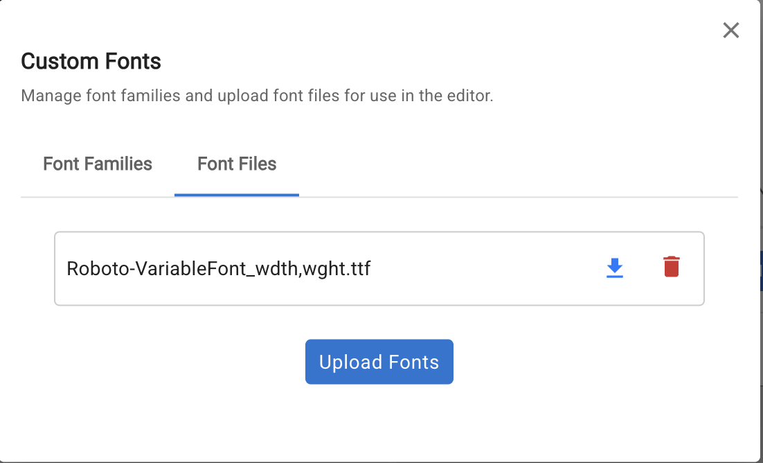
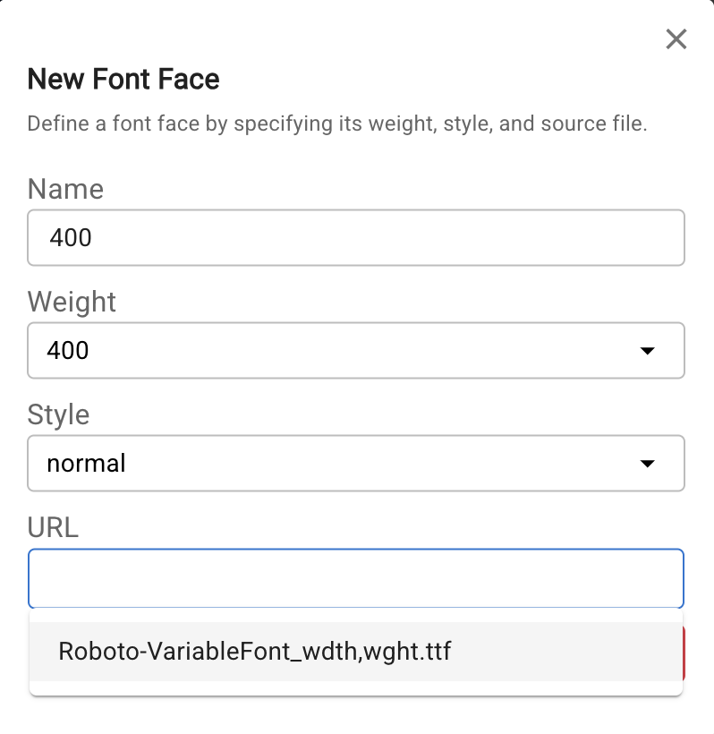
2. Upload Font Files
Switch to the Font File tab and click Upload Fonts to upload your font files.
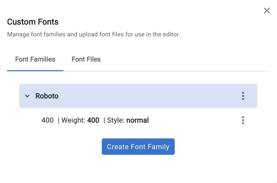
3. Create Font Faces
Back in the Font Family tab, click the three-dots icon on a font family and select Create Font Face. Fill in the weight, style, and select the uploaded file from the URL dropdown.
4. Select the font
The new font family now appears in the font picker. Select it to apply it to the current element.
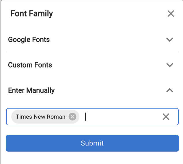
Enter Manually
For system fonts (e.g. Times New Roman, Georgia) or fonts already loaded via a Custom Code <style> tag or external URL, use Enter Manually to type the font-family value directly.